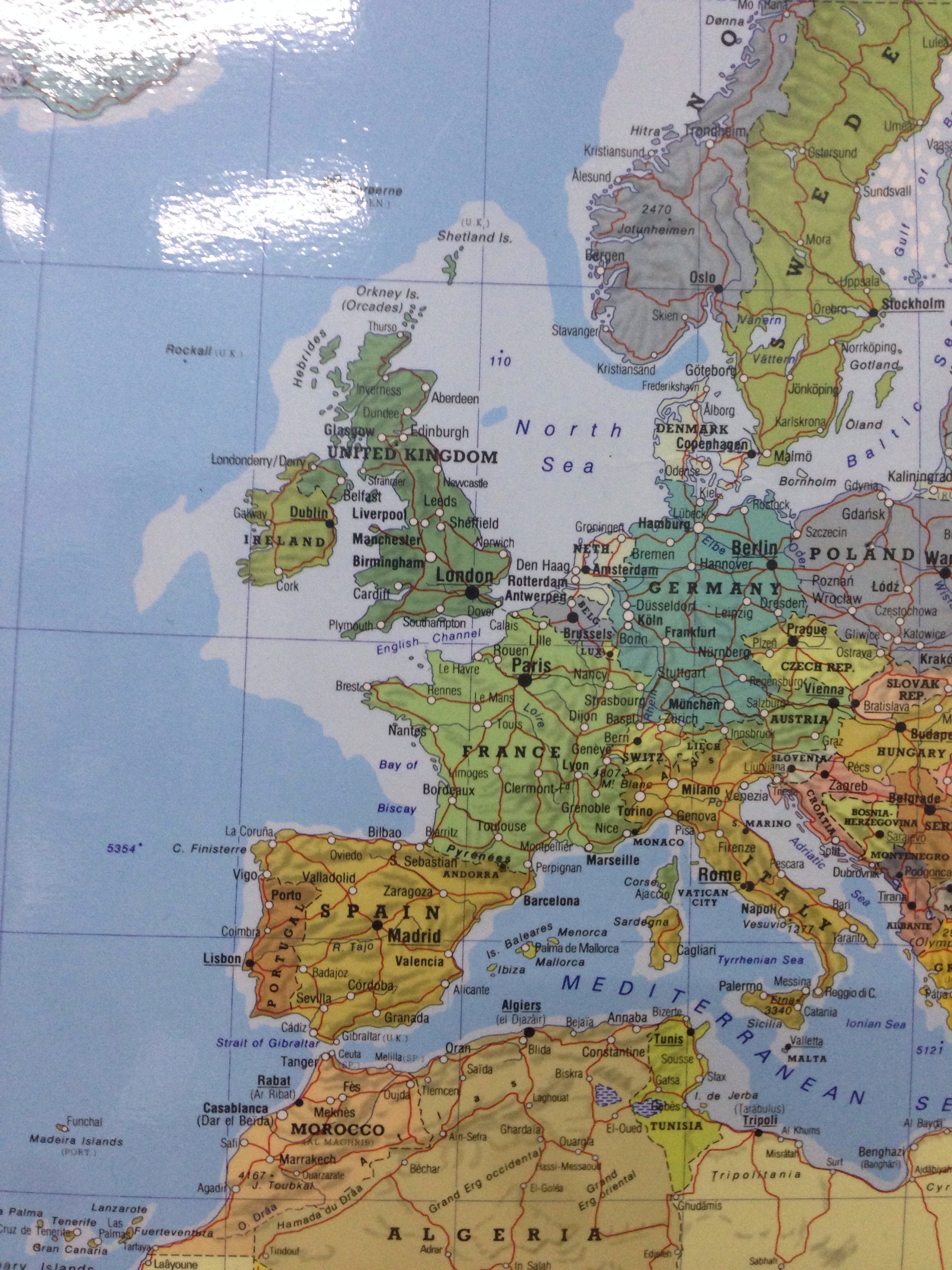
Maps eh? This is the picture of a wall chart by Michelin (the French company but for their English cousins). It is a Van Der Grinten projection with changes made by Michelin. I’m not sure it’s ethical to change a map projection but they did.
This map makes Great Britain look the same size as France. The real multiplier is that France is 2.2 times the size of the UK, let alone GB.
Spain is really twice as big as Great Britain.
Although it’s not on this picture Kenya looks about the same size as GB but is in fact 2.4 times bigger.
What have Michelin done? They’ve made it appear that Great Britain is larger than it is really. Oh dear. Perhaps we should all watch the
Somebody’s Going to Emergency, Somebody’s Going to Jail
episode of the West Wing. It will explain it all, I assure you.
By the way, the last time I saw this episode of the West Wing was summer 2013 in Keswick while I was visiting penguin.