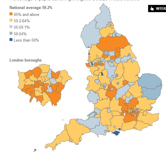
I don’t understand the logic or reason behind this:
My questions are:
- What colour would 54.4% be?
- What colour would 59.15% be?
- What colour would 64.5% be?
Why are they coloured using whole numbers to differentiate the boundaries and then why tenths for the light blue-ish colour?
Ohhh, I think I get it. Because the national average is 59.2% that means it’s ok to have three colours below that and only two above it.
Does this chart say that no local authorities managed to get the average but some were below it and some were above it?
There are about 52 areas below average. There are way more (I got bored of counting) above that. Does this mean there is positive skew?
Do you know what?
I CAN’T TELL FROM THIS DIAGRAM. IT TELLS ME NOTHING OF ANY USE.

