Oh dear. They’ve only gone and updated the iOS software for controlling my home sound system. It’s a full new version with a new “look and feel”.
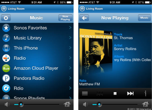
The old version:

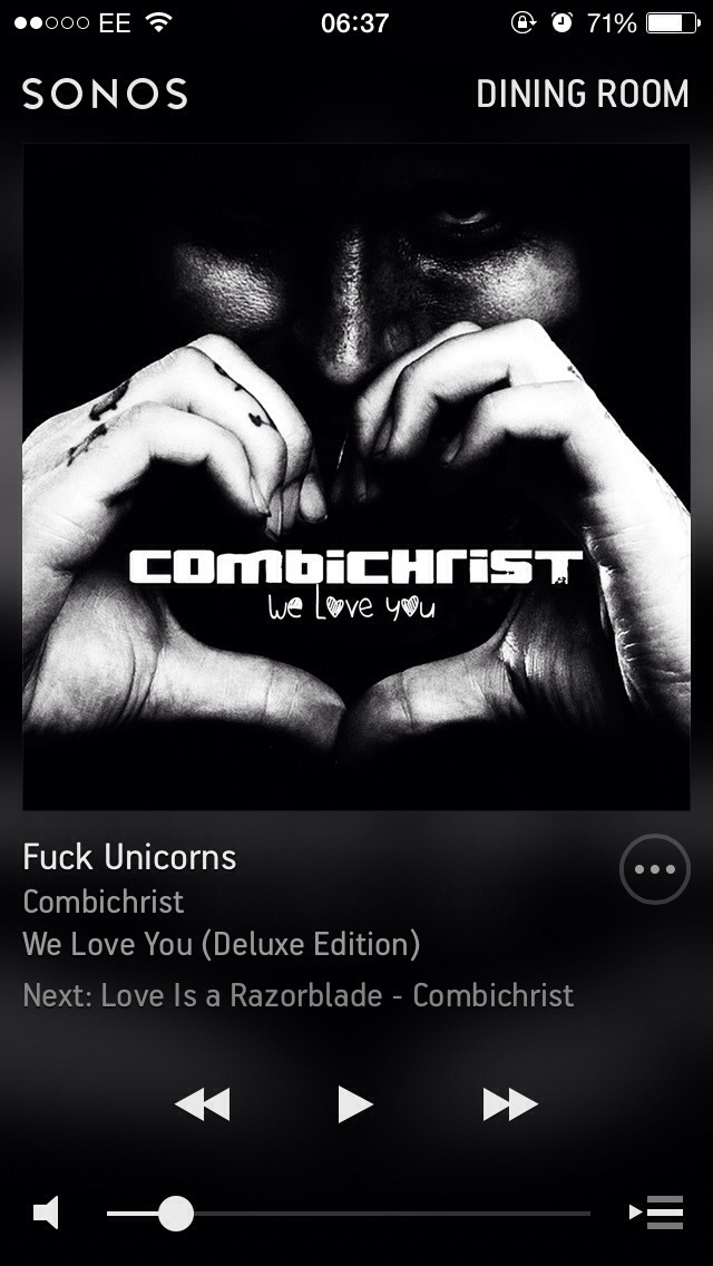
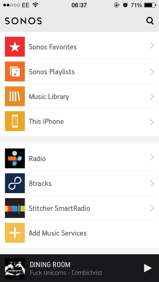
The new version (my music):
Last night after the update it took me FIVE minutes to figure out how to control another room in my Sonos system. That’s not right! It means the app isn’t intuitive. I don’t like it. I know I’ll get used to it but I don’t think it’s an improvement.
I understand the aim is to make it easier to search for content. So the front page is now a nice clean white colour (I don’t like this) and the search icon is there, so you can easily search all content including online services to which you subscribe. The Sky TV guide also made this change recently so that searching for content is the main function of the controller. This means we are meant to watch more and download more stuff. I’m not sure it’ll work, at least for me. I guess I won’t have access to the data to find out and the companies are never going to let me know.
Look, I just don’t like change. Or rather, I don’t like change that is then less intuitive than the predecessor. Using this new software wasn’t obvious.


