I have a communication I am trying to write but I can’t yet find the words. I know what I want to say and can probably sum it up in two short sentences but I really want to elucidate my offerings with my personal experiences, up to a point.
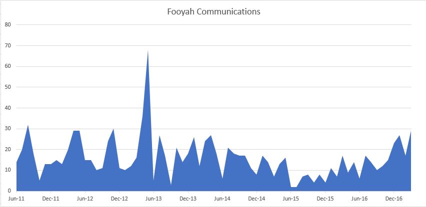
So, I wondered if I could glean some data from this website. It takes effort, time and concentration to write these communications, even if it doesn’t look like it. I thought I’d look at how many communications I had published each month since this site started and spot how that fits into my plans for another piece of writing.

I don’t like Excel, or at least the graphs it draws but this is a start. Except I’m sure it doesn’t show what I expected. Believe it or not that is a good thing in science. But it won’t help me with my writing.
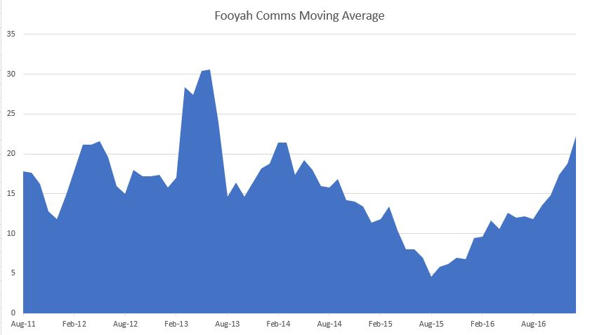
Perhaps a moving average would work?

Nope. There’s not a great deal I can take from this either. My hypothesis failed entirely. Which, again is a good thing. Great bounds in understanding are made not when things go right but when they don’t go as expected. “Hmmm, that’s interesting” is probably the most exciting thing a scientist can say.
So, this didn’t work. I need another way of getting into writing the next something. It’s currently sitting as a draft with thirty words looking all sad and alone. I will get around to it. The tricky bit will be deciding which words and what order!

