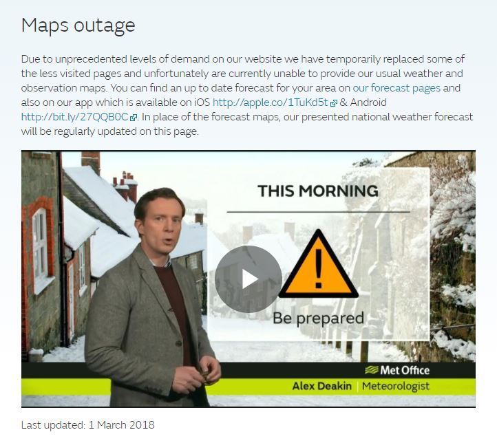
I just wanted to see how the rain/snow fall was going to be over the next few hours, to see the general direction the weather system was moving. But, no, we broke the Met Office.


"Nothing but the rain"
I just wanted to see how the rain/snow fall was going to be over the next few hours, to see the general direction the weather system was moving. But, no, we broke the Met Office.

I recently saw that the Met Office had a new weather app. I think it popped up on the front page of the app store. I was interested as I’m quite fussy about my weather apps. Once you get used to one and the information it gives you it’s quite hard to change. Much like buying a new wallet, which I have to do soon and it fills me with dread. By the way, I don’t like the term “app”, I’m not particularly fond of the term “application”, to me these are programs and always will be.
Here’s the front page of the new app:
The new app had embedded video forecasts from the Met Office – these are not needed, I’m too old to care for video forecasts. Also, video on a phone is antisocial and useless, I can get the same information without the noise and movement. I think this may be a generational thing. I don’t need sound and people to inform me something that I can see in a diagram or map. It could possibly be why I also don’t like the news that is broadcast into our homes all the time [hint: change channel, which I do].
Here’s another view of the new app:
I’m not sure I like the days across the top. I think that’s mostly because I the older app [which is still available] had the days going down the screen. The worst part of the new app is the weather alert screen. This screen used to be a map with colours over it.
This is a good weather warning map. It tells me what I need to know. The new app just has text to read. I can’t be bothered to read it. The text is broken down into regions. I can be even less bothered to find my region and then decode the words. Oddly, I do like listening to radio weather broadcasts so maybe I’m just weird here.
One last thing. The new app has done away with proper weather charts. These actually mean something to me and I like them. They give an overall impression of what is really going on in the weather. Here are some examples of good stuff:
Day by day and then lovely extra information if you need it. There’s a page that will give hour by hour predictions too.
Look at these maps. Aren’t they pretty and lovely. They let you know what’s going on. The new app doesn’t have this. Which is a shame. I do get the feeling that sometimes things are “improved” to include lots of new functions but the reality is that they just fuck them up.